Colour affects and reflects many things, including your personality and moods. Imagine inviting friends over to your crib and watching them gawk at the horribly mismatched carpet-sofa-wall colour combination. The nightmare has begun even before the party could.
Before you choose the colours, you have to understand their properties, and decide on what design theme you would like to come home to everyday. Zen? Modern? Industrial? Rustic? Scandinavian? Minimalist?
Let’s find out more:
1. Colour Trends
There’s a good mix of homeowners preferring warm and cool themes. Director of Dreamvision Designer, Samuel Lim, says that white, black and grey colours have always been well received among Singaporeans.
Warm colours such as brown tones are also popular, according to Rachel Chew, Senior Consultant at ID Gallery. “It gives people a very cosy feel and this colour theme trend will still continue in 2017.”
However, if your space has direct sunlight, Rachel recommends using cool colours to “alleviate the warm feeling”.
2. Warm, Cool, And Neutral Colours
Red, yellow, orange are warm colours, whereas green and blue are cool colours. But it’s not all black and white (pun unintended), as there is also warm blue, cool yellow and cool red. So it doesn’t mean that if you’re going for a warm theme, you can’t use blue in your design.
On a basic colour wheel, the colours go clockwise from yellow, orange, red, violet, blue, to green. Neutral colours like beige, grey, and brown are not on the colour wheel.
Chief Interior Designer Lu Yi Yi from The Mind Design says the most used colours are those found in nature; calming colours like neutral tones, pale blues and earth tones.
While it may sound boring, it only makes sense to think long-term and see how this colour scheme can be versatile to changing lifestyles.
If you gravitate towards a particular colour, a monochromatic theme using varying intensities of one colour in your space will be interesting. Yi Yi advises, “Work within a spectrum of tones; tones and shades arranged in the same vertical lines will always complement each other.”
3. Shape Of Your Space
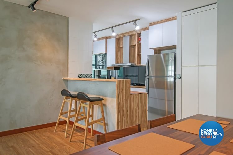
HDB 5 Room by Dreamvision Designer Pte Ltd
To soften the rigidity of our concrete pigeon holes, Director Samuel Lim (Dreamvision Designer) believes that the colour combination of white and green blends well with a square space, while a white and grey combination will go very well with a rectangular living room. “Those colours will prevent the space from looking too square and too rectangular,” he says.
“I personally prefer ceilings to be in lily-white colour as it produces a very warm effect, and isn’t obvious,” Samuel adds. Unlike landed properties, condominiums and HDB flats usually have low ceilings, and painting your ceiling white can visually extend it.
4. Size of Your Space

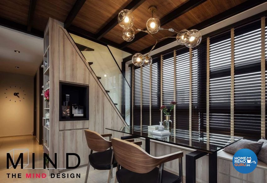
Condominium by The Mind Design Pte Ltd
space, making objects nearer and a space smaller, while cool colours recede it. This means if you paint a wall red (a warm colour), it looks closer to you than if you paint it green (a cool colour).
Lu Yi Yi from The Mind Design says that “deeper colours tend to suit a cosier space like a living room, and strong colours can be used in smaller amounts to bring depth and a focal point to any space”.
“Using two colours in equal measure can be surprisingly effective. Also by using more of one colour and less of another, you can create a sense of balance like a grey hue, with an accent of sky blue. Consider which colours you are using in one area, and also how much of each,” she adds.
Alas, there’s no unique colour combination, but there certainly are unique designs that can be tailored by your interior designer after they understand your lifestyle needs and sit you down for a colour selection. Choose a theme and colour combination that are easy on your eyes and something you won’t regret after a few years!


