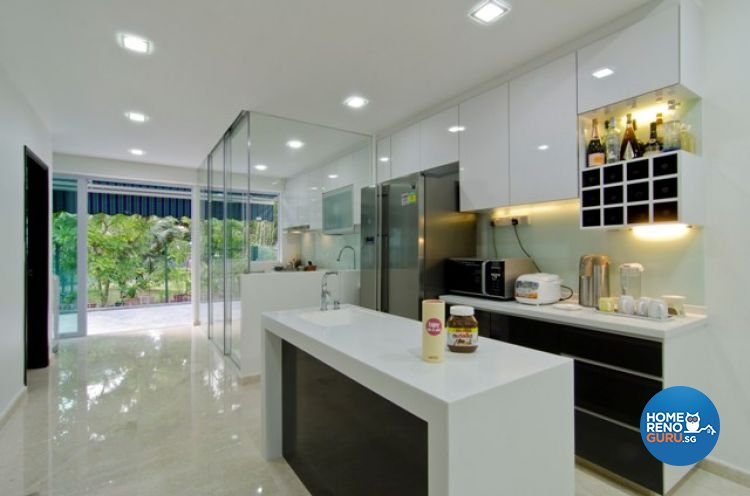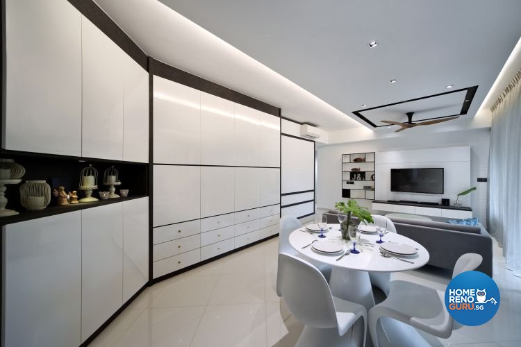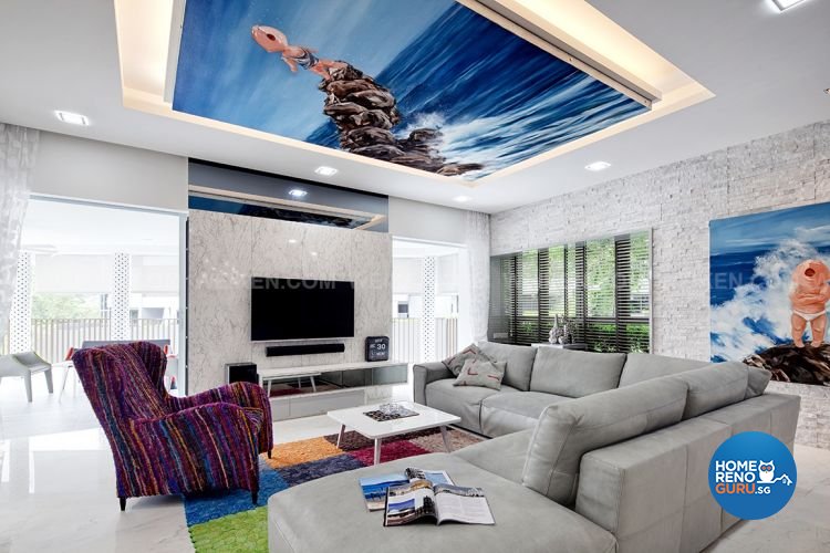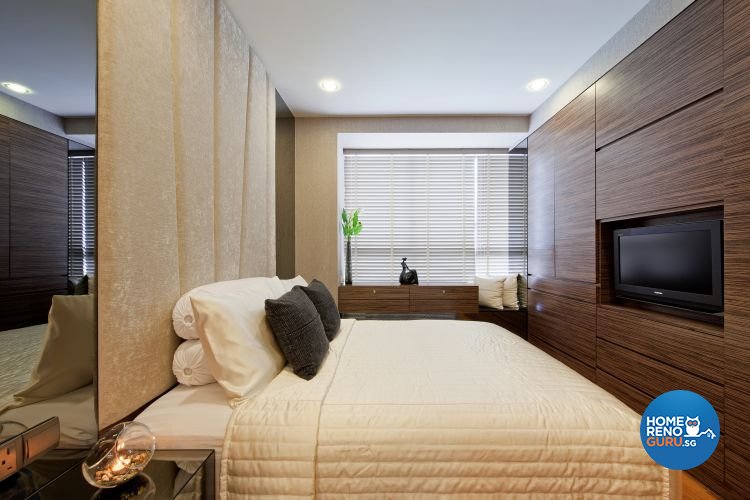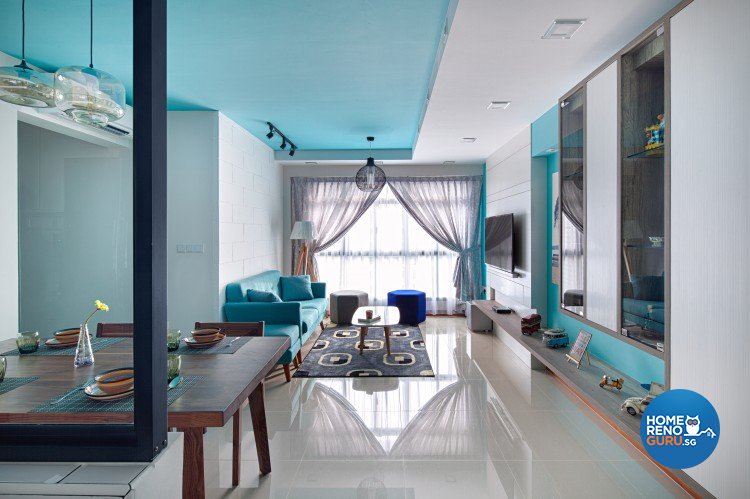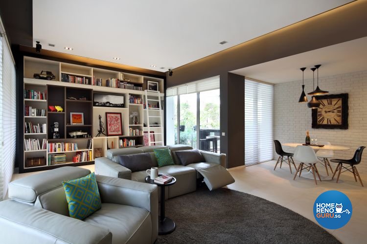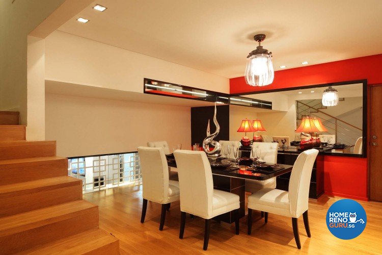
There is a world beyond beige. While white is all right, it’s nothing special. Interior Designers always have neutrals as their default option, and in reality they’re opted for more often than not. Should you leave your conservative clients to dwell within their colour comfort zones, literally? Or should you coax them into the wonderful world of colours? We asked leading interior designers to share their views on paint hues.
THE LAND OF BLAND
Of the interior designers we spoke to, just over 50 percent acknowledged that the majority of their clients opt for white or neutral colour schemes. To be fair, it was pointed out that many homeowners err on the conservative side out of consideration for resale value. Other designers cited instances where conflicting preferences between husband and wife can lead to a stalemate – which leads to the common scenario of ‘settling’ on neutrals because neither party will compromise.
Most importantly, given the multi-generational nature of many Singaporean households, one colour scheme must, if not fit all, offend nobody. After all, it’s not easy to pander to teenage tastes without outraging grandparents. A walk on the wild side is all well and good if you have the luxury of your own pad, but when you share a living room with three generations, the middle of the road is a safer route.
Now for the good news. The results of our research made it abundantly clear that colour is cautiously creeping into Singaporean homes.
For the record, it must be stated that the preference for neutrals is not the result of unimaginative designers, but the natural choice of conservative homeowners. All the designer questioned made a point of saying that no policy regarding colour recommendations existed. Rather, the company policy in all cases was to undertake a leisurely and detailed consultation with the client in order to understand their lifestyle and personal taste.
FENGSHUI COLOURS HOMEOWNERS’ CHOICES
Singapore is both a modern metropolis and a country steeped in tradition. Unprompted, several designers highlighted the role that fengshui plays in influencing their clients’ colour-related decisions.
“Interior paint colours are proposed accordingly after discussions with clients on their desired themes. There are cases where we need to adhere to their fengshui colours,” said Ivan Ong, Director of Ideal Design Interior.
His sentiments were echoed by Erin Tan, the General Manager of Vegas Interior Design, “We do not have any policies to always recommend neutral colours, as colours are one of the major factors that can bring out the character and essence of a particular design style. Of course we do have to take into consideration the request and preferences of our clients, especially when it comes to the factor of geomancy.”
TRENDING COLOURS: FIFTY SHADES OF GREY
When we asked designers to share the colours that were most frequently requested by their clients, a few trends emerged. Cool blues and greens, befitting the clean Scandinavian look, were repeatedly cited as popular choices. But it was their close relation, the ‘new neutral’ grey, that emerged as the local favourite.
“There has been an increase in demand for the grey palette. It can take front- and centre-stage, upstaging its neutral cousins, taupe, beige and ivory. It’s modern and edgy yet timeless and classic. I think of it as the perfect chameleon, as it suits just about every room, every mood and every setting,” said Vincent Neo, Director of Weiken.
Elsa Liang, Designer Manager of De Style Interior, concurred, “Besides whites and neutrals, the next most popular requests would be light and dark grey.”
BOLDER AND BRIGHTER
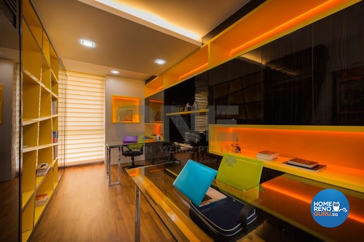
All of the designers we spoke to predicted a bolder, brighter future for the Singapore interior design industry and the homeowners it serves. Due to increased exposure to international trends via the Internet, television reality shows based around home makeovers, and overseas stays in cosy boutique hotels that feel like ‘home’, homeowners are taking baby steps towards stronger colours, quirky combinations, loud statement feature walls and special effects paints.
“Many locals actively research interior design and home décor, mainly through TV channels, blogs and magazines. This helps them better steer the direction of their whole design and layout, and eases communication with their designers. Nowadays, we definitely see a degree of boldness emerging, balanced by a desire for pragmatism and durability,” said Ivan Chai, Director of Distinct Identity.
EDUCATING CLIENTS
Though the signs are encouraging, there is a long way to go before Singapore homeowners shed their reputation for being conservative in their décor and colour choices. The vast majority of designers consulted were forthcoming with ideas on ways to coax clients out of their colourless comfort zones.
The obvious strategy of ‘show and tell’ was repeatedly recommended by industry authorities.
Gary Wee, Director of One Design Werkz Pte Ltd, recommends “… visualisation with apps”.
Kathryn Goh, Business Development Manager for Black N White House LLP, believes that inspiration can come from fields outside of interior design, since ideas and aesthetics are transferable across disciplines. She suggests, “…showing clients the latest colour trends in the arts, fashion, the furniture industry and so on”.
THE FUTURE LOOKS BRIGHT… AND MULTI-COLOURED
When we asked designers to predict the colour trends for 2016, we encountered a riotous rainbow-coloured forking path. It seemed as if the designers had donned blindfolds and simply thrown darts at a colour wheel. No single trend dominated the predictions, and certainly no consensus emerged.
Here’s a sampler of designers’ predictions…
“With the increasing trend of cafes hopping in Singapore, young couples will be seeking to create their home a place for gathering and to chill with their friends. Dark and cosy, warm colours will be in demand to set the desired ambience,” suggested Vincent Neo, Director of Weiken.
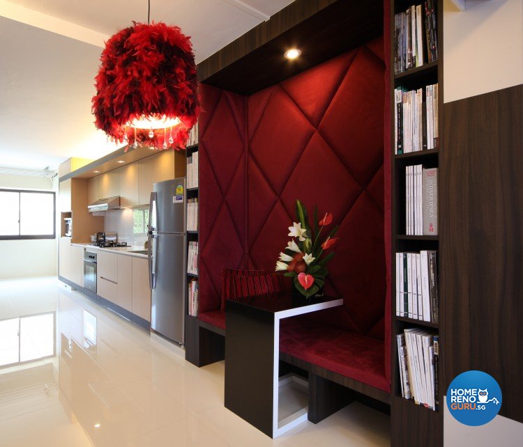
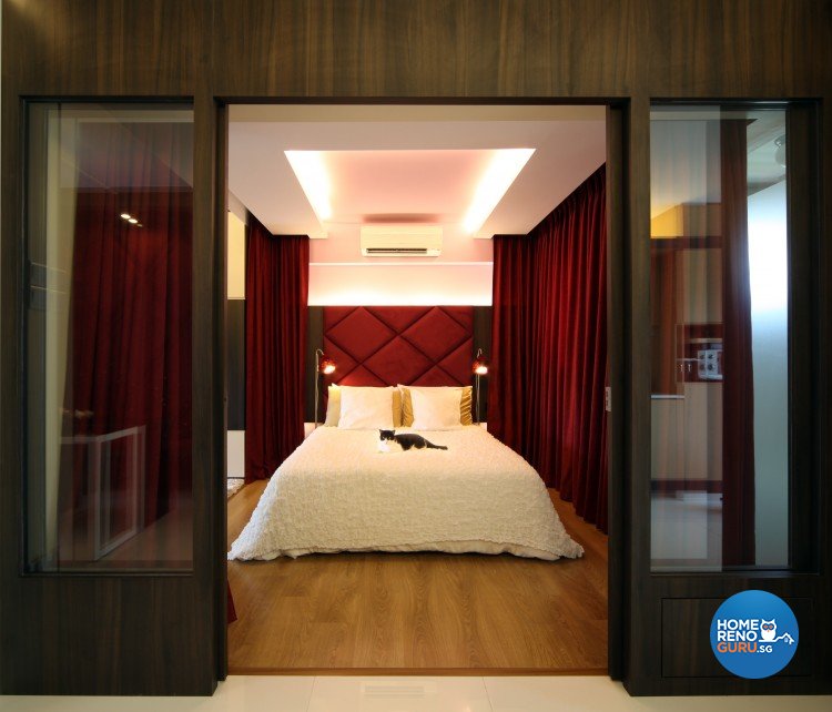
Kathryn Goh, Business Development Manager of Black N White House LLP, volunteered: “Burgundy red, greyish blue, pastel pink and yellow, and dirty light or sandy beige.”
Erin Tan, General Manager of Vegas Interior Design, predicted several key palettes including: natural colours like warm rosy clay and sheepskin beige; the high-contrast combination of silver, sunny yellow and cobalt blue; the pastel prettiness of wan blue, pale peach and tender yellow; and the subtle symphony of smoky blue, rice grain, halcyon green and smoky topaz. Joyful candy colours, refreshing blues and vibrant colours such as red, purple and orange also got a nod.
Ivan Chai, Director of Distinct Identity, cited “dark purple, olive green and navy blue” as his hot tips for 2016.
Clearly, the future is bright, but it’s anything but clear. In the next part of this topic, we’ll go straight to the paint source, the colour consultants of Nippon Paint. Let’s see how their official trend forecasts tally with the predictions of our local interior designers… or not.


