My custom title

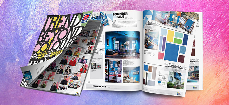
Step Out Of Your Colour Comfort Zone - Part 2: Trend Beyond Colours 2016/2017

30 Oct 2015

Design Trends

Step Out Of Your Colour Comfort Zone - Part 2

TO THE SOURCE

In the 1st part of this series, we asked leading interior designers to share their views on paint hues. Since the jury was out among interior designers as to what colours would rule in 2016, we turned to the source – paint companies. Or rather, the leading paint company in Singapore, Nippon Paint.

Here, we share Nippon Paint’s official annual guide to colour trends: ‘Trends Beyond Colour 2016/2017’. Be among the first to view the next big things in paint colours, and pass on the knowledge to your style-conscious clients.


FOUNDER BLUE

Trend Beyond Colours - Founder Blue

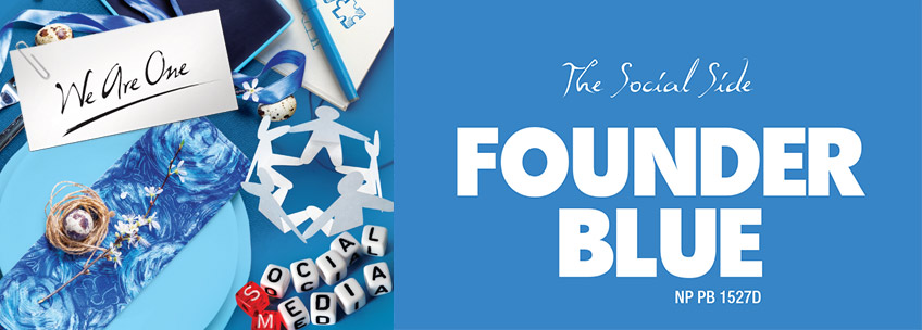
The first trend outlined in Nippon Paint’s annual ‘bible’ of colour trends is dubbed Founder Blue. This vibrant blue reminds us of the Greek islands, sipping red wine with friends and supping off blue and white plates… It’s a statement-making blue that would add a shot of energy to a living room or bedroom, and transform a regular home into a year-round holiday house.

“The tone of Founder Blue NP PB 1527D is often associated with depth and stability, symbolising trust and loyalty… This colour is inviting and trusting, enhancing self-expression, allowing us to interact and socialise comfortably in life.”- ‘Trend Beyond Colours 2016/17

NP PB 1527D


GRAY KNIGHT

Trend Beyond Colours - Gray Knight

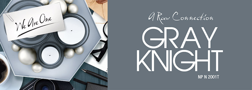
The next colour in Trend Beyond Colours 2016/17 comes as no surprise – it’s a blue-tinged grey that corresponds with local interior designers’ observations of the rise in popularity of the ‘new neutral’. Meet the classy, cool and elegant Gray Knight.

“Gray Knight NP N 2001T eludes mysteriousness and acts as the perfect blank canvas, allowing us to explore further, not just in knowledge, but also in life. Expressing a secretive ambiance, we innocently share desires without hesitation, escaping from our real lives, into a world where nothing is unknown.”- ‘Trend Beyond Colours 2016/17

NP N 2001 T


GREEN TUFT

Trend Beyond Colours - Green Tuft

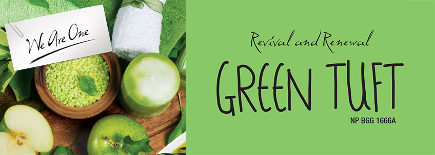
A vibrant leafy green found its way into Nippon Paint’s vista of probabilities for paint trends in the coming year. Green Tuft reminds us of all things eco-friendly, and looks crisp as a fresh green apple with white and wood.

“Bringing freshness and a sense of renewal to life, Green Tuft NP BGG 1666A allows us to recollect our thoughts, providing us with stability and endurance. Being the most restful colour for the human eye, this fresh shade can help us feel comfortable and safe.”- ‘Trend Beyond Colours 2016/17

BGG 1666 A


TAVERN BUFF

Trend Beyond Colours - Tavern Buff

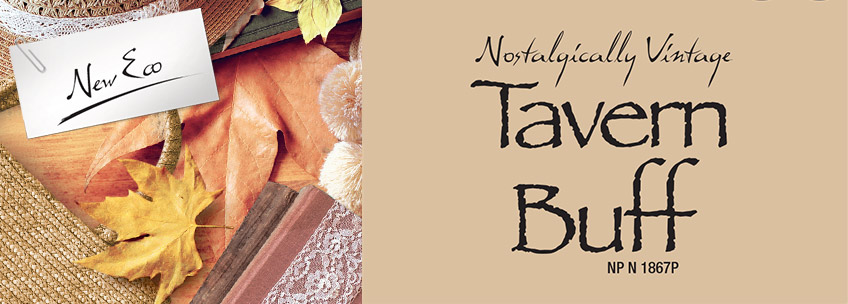
A little bit biscuit, a little but caramel, a little bit taupe, this hard-to-define neutral with a twist adds warmth and a vintage vibe to any room.

“Tavern Buff NP N 1867P can make you feel connected to nature once again, surrounding you with the great warmth and love that only something so natural can make us feel. Being able to feel wholesome again with a natural shade brings a subtle serene soul into the environment, something so delicate and tranquil; you will want to embrace yourself in the natural state of the world.”- ‘Trend Beyond Colours 2016/17

NP N 1867 P


LUSH

Trend Beyond Colours - Lush

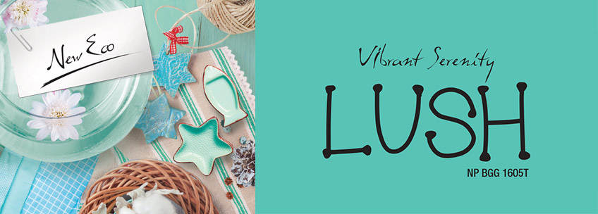
A softer, blue-tinged green also made it to the ‘it-list’. Nippon Paint calls it Lush. A vision of curling up on a bed of cushions, gazing out to sea from a bay window, springs to mind…

“Reflecting the colour of the ocean or the sky, we can bring tranquil beauty into our homes with Lush NP BGG 1605T. Offering inspiration and a sense of renewal, its calming effect can work wonders in the bustling world we live in.”- ‘Trend Beyond Colours 2016/17

NP BGG 1605 T


VOLCANIC BLACK

Trend Beyond Colours - Volcanic Black

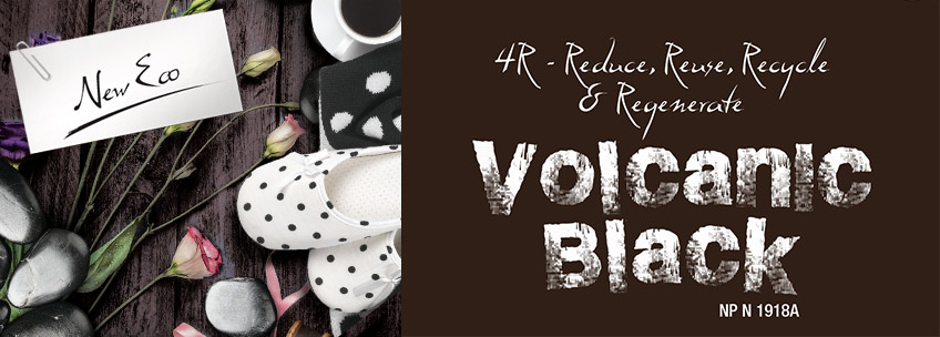
Charcoal, tobacco, cinnamon – these are a few of the things that are conjured at a glimpse of this masculine, moody colour: Volcanic Black. We can imagine it adding drama and atmosphere to a den, a library, or a dining room.

“A rather dramatic colour to use when designing a space, due to the dark accent it carries with it, Volcanic Black NP N 1918A is also an earthy colour imitating nature. Modernising the eco-generation, a dense outlook is associated with the solid beauty of this colour.”- ‘Trend Beyond Colours 2016/17

NP N 1918 A


BEING PEACH

Trend Beyond Colours - Being Peach

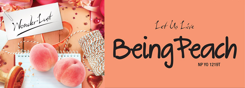
Soft, summery, sweetly romantic, this pastel peachy shade that hovers between pink and orange would look at home just about anywhere. It’s called Being Peach, and it’s one of Nippon Paint’s happiest hues for 2016.

“Being Peach NP YO 1219T is a statement colour all on its own. Expressing spontaneity, this exotic colour radiates positivity and youthfulness. When we find something extraordinary to explore, a new balance will be presented.”- ‘Trend Beyond Colours 2016/17

NP YO 1219T


BLUE LULLABY

Trend Beyond Colours - Being Peach

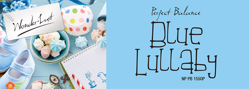
Not quite baby blue, not quite sky blue, this slightly grey-tinged blue would be a fitting foil for stronger colours and eclectic décor collections. Nippon Paint calls it Blue Lullaby, and hails it as a colour that represents perfect balance.

“The line between personal and professional life can overlap, but with Blue Lullaby NP PB 1550P, balance is present with its calming effect. Allowing us to imagine and inspire towards something, we can reward our desires and experience new depths of life so that we can find harmony and that perfect balance.”- ‘Trend Beyond Colours 2016/17

NP PB 1550 P


FAST CAR

Trend Beyond Colours - Being Peach

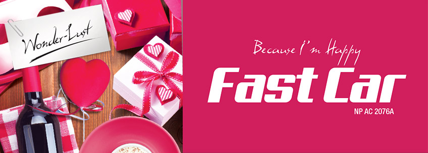
Intensely coloured flowers and summer berries spring to mind when we feast our eyes on this anything-but-shy shade of dark reddish-pink, dubbed Fast Car. It would make a fabulous feature wall in a living room, or a striking wraparound colour to blanket an intimate boudoir. We can see it working equally well with clean, modern lines and ornate Victorian chandeliers and Chesterfield sofas.

“The colour associated with Fast Car NP AC 2076A may be seen to reflect danger, however, it is an intense colour, filled with passion, desire and determination. If we have discovered something that ignites that flame within, that feeling of ecstasy is one that cannot be imitated. ”- ‘Trend Beyond Colours 2016/17

NP AC 2076A

whataspp icon